Blog

View From My Keys :: 9th March 2013

DerekClarkPhotography.com-DSCF1274It was good to leave the studio rehearsals behind and get back on the road to play to an audience again. DerekClarkPhotography.com-DSCF1261-EditBy the power of Grey Scull or by the power of electricity? Horsing around with a laser before the gig (left) and a fan gets close enough to feel the magic (right).

DerekClarkPhotography.com-DSCF1252
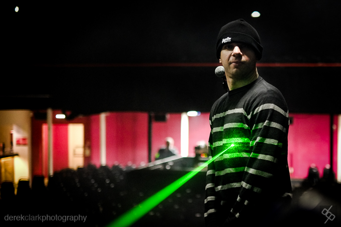
Some say he traveled here from the planet Krypton in a mystical craft. Others say he came from Turin in an Alfa Romeo.

View From My Keys :: 5th March 2013

20130308-113159.jpgGuitar faces don't come naturally, they have to be practiced and perfected before unleashing them on today's public. The examples above are the 2013 faces that have been finely tuned and are on the cutting edge of what's possible from todays musicians. If you would like to be successful in the dark arts of facial performance, start by sucking lemons...that should tighten-up your embouchure. 20130308-113319.jpgThe shot above was taken with the X-Pro1 and the 35mm f1.4. The shot below and at the top of the post was with the X-E1 and the 18mm f2. All three were shot wide open.

20130308-113337.jpgThe mighty Hammond organ has been the cornerstone of many great rock bands through the decades! This XK1 replicates the sound of the amazing B3 that can be heard on countless classic records of the 60's and 70's. It's a beast!

The Digital Contact Sheet :: Episode 4

DigitalContactEpisode4-680 Welcome to Episode 4. This time round we'll be looking at some shots of a comedian at last years Belladrum Festival in Scotland. I was there as a musician and had a lot of time to kill as we were the last act of the day. Festivals are great places to photograph as you get a huge amount of things going on in a relatively small space. There's live bands, comedians, fire eaters, vendors and some of the craziest humans on the planet! Click HERE to see a blogpost I did at that time for more shots from Belladrum Festival. I could hear laughter coming from the tent and wandered in to see what was happening. I got the impression most of the audience were waiting for their favourite band to come on, rather than letting themselves enjoy this comedian's act. I didn't catch his name, but he was pretty good. Maybe someone will recognize him and let me know?  Remember to click on any of the photos for larger versions!

DerekClarkPhotography.com-TDCS-E4-Colour680

So here's the contact sheet, shot in colour as always. All taken with the X-Pro1 with the 35mm f1.4 at 3200 ISO. There's nothong interesting in the colours here and certenly nothing that adds to any of the photographs, so it's black and white time (reaches under the desk for the one prepared earlier).

DerekClarkPhotography.com-TDCS-E4-Black680

You can see from the black and white contact sheet that it's much easier to spot which ones work and which ones don't. Colour has the ability to make things more complicated, but black & white cuts it down to the basics.

The ones with the red X's are all missed focus. It's nothing against the X-Pro1 as it was very dark in that tent. The ones with the red outline are my picks and I could use any of them. Although I haven't outlined DSCF7362 (second one up on the left hand side), I actually quite like the amount of negative space in that shot. I chose the second last shot as my favorite because it's more af an action shot. He lunges forward to hammer home the punch-line. The rim light on his back is quite nice too!

DerekClarkPhotography.com-TDCS-E4-Original680

This is it straight out of the camera, but rotated slightly to fix a tilt to one side. I'm sure you'll agree that the colours (what little there are), don't really do much to enhance the photo. The open door revealing the night sky is also a distraction.

DerekClarkPhotography.com-TDCS-E4-Edit680

I think this shot works well in black and white, which also brings out that rim light on his back. I decided to crop it down slightly to remove the second bank of stage lights that were creeping in on the upper left hand side. I found they were a distraction and could take your eyes on a little detour. The conversion to b&w was done in Nik's Silver Efex Pro 2, where I started off by using the Wet Rock preset (you've gotta start somewhere!). It took care of the open doorway enough to no longer be a distraction. I then added slightly more contrast, a bit more grain and I was done.

So that's it for this installment. I'm aiming to do a new Digital Contact Sheet on the first Tuesday of each month, which should be easy to remember. As usual, if you have any comments or suggestions, stick them in the box below.

McCullin :: DVD Review

20130302-130317.jpg"War is partly madness, mostly insanity and the rest of it is schizophrenia!"

Don McCullin

McCullin is a feature length documentary film by Jacqui & David Morris on the life and work of photographer Don McCullin, who is most known for his hard hitting photographs of the conflicts in the 50’s, 60’s, 70’s & 80’s. This film mostly covers Don's war photography, but also features a great deal of his work on poverty in post World War II Britain.

The first thing that stands out right from the opening titles, is the haunting score by Alex Baranowski. Music can make or break a documentary and this beautiful soundtrack does for McCullin what Antonio Pint's score did for the fantastic Senna documentary. I was glad to find the soundtrack for McCullin HERE on iTunes.

Another thing that struck me, was the amount of unseen film footage from the various conflicts featured in the film. There's no doubt the team that made McCullin did a huge amount of research and they should be congratulated on such a fine job of putting this together. The whole film is woven together with Don's superb black and white photographs, video footage and interviews with Don McCullin and Sunday Times editor Harold Evans.

Although the scenes of war are very graphic and show many mutilated bodies, including people flattened by tank tracks, I found the most harrowing scene was of a group of starving Biafran children. One trying to drag a smaller sibling up a concrete step by his or her skinny arm, the tiny body twisting as it's head bumps off the step.

McCullin is out now on DVD and Bluray and is unmissable! If you are a human (I'm assuming you are if you're reading this), then you need to watch this! In my opinion, this film should be used in schools to show the horrors of war!

[embed title="McCullin official UK trailer - in cinemas & Curzon on Demand from 1 January"]http://www.youtube.com/watch?v=7VWjo5XUIfw[/embed]

Italy :: Venice & Verona With The X100 & X-Pro1

DerekClarkPhotography.com-Italy-DSCF4591This post is just about showing a few shots from Italy. I have hundreds sitting on my hard drive, so I thought it would be a good idea to throw a few up here. These shots are from Verona, Venice, and Jesolo. They were all taken with either the Fuji X100 with it's built in 23mm f2 lens or the X-Pro1 with the 18mm f2. I'll note which is which at the bottom of the post.DerekClarkPhotography.com-Italy-Italy2012DerekClarkPhotography.com-Italy-DSCF4502DerekClarkPhotography.com-Italy-DSCF4608DerekClarkPhotography.com-Italy-DSCF4626DerekClarkPhotography.com-Italy-DSCF4577DerekClarkPhotography.com-Italy-DSCF0205DerekClarkPhotography.com-Italy-DSCF0221DerekClarkPhotography.com-Italy-DSCF9029DerekClarkPhotography.com-Italy-DSCF8792

  • Photos 1 - 6::  Verona, Italy, X-Pro1, 18mm f2
  • Photos 7 - 9::  Venice, Italy, X100, 23mm f2
  • Photo 10::  Jesolo, Italy, X100, 23mm f2


Professional Photographer Of The Year Finalist

PPOTYnews
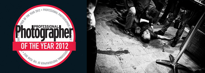
I'm delighted to be a finalist in The Professional Photographer Of The Year Awards. I received an email yesterday confirming I was in the final ten of the News category. A selection of the finalist photographs from all categories will be featured in the April edition of Professional Photographer Magazine (on sale in March) and the winners will be announced at the awards event in Cheltenham at the end of March. You can read more about this shot (taken with my X100) in the previous post The Digital Contact Sheet :: Episode 3

The Digital Contact Sheet :: Episode 3

DigitalNegative680-E3 It's only episode 3, but it's time to change the format of this feature. When I first thought about doing The Digital Contact Sheet, I imagined it with...well you know, contact sheets. But rather than sit on the idea for a while and get it right in my head and then transfer it into a blog post, I went ahead and jumped in before I really thought it through. That's not always a bad thing as ideas come thick and fast and most of them never see the light of day. So I kind of went with the "ship anyway" mentality, but now I'm changing it into what it should be, with proper contact sheets and all. I hope this is a welcome change.

DerekClarkPhotography.com-003

This sequence of images were shot in Italy last year at The Moonlight Marathon near Venice. The Contact sheet, above, shows the photos straight out of camera, which in this case was the Fujifilm X100. This ended up being called Running Into Darkness and was my first story on the Kage Collective website.

DerekClarkPhotography.com-

I usually know while I'm shooting a project if it will be in black & white, Colour or a mixture of both. This shoot was always going to be black and white, so I've converted the contact sheet in Photoshop and used +70 of Contrast and +10 of Brightness. This also helps to show the markings in red. As this is The Digital Contact Sheet my markings were done with a Wacom tablet, rather than a wax pencil.

DerekClarkPhotography.com--2

The red boxes are the frames I would use and the ones with the red X's are the rejects. The others are OK, but more than I need. The three with the stars are the ones that tell the story. It's interesting to see a sequence of images in contact sheet form. One of the things that stands out right away, is whither I have worked the scene enough. I know by looking at this sheet, that I would have liked to have moved around a bit more and got some different points of view. Remember to click on the contact sheet above to see a larger version.

DerekClarkPhotography.com-DSCF9782I was shooting with the X100 which has a full frame equivalent of a 35mm lens, so I'm pretty close here. It's a tense situation and I don't want to come accross as too mercenary, so the shots of the guy on the ground are all shot from the hip. I would have framed it differently if the camera had been up to my eye, but I think this wonky composition adds a bit of tension to the shot and works well.

DerekClarkPhotography.com-DSCF9782-Edit

I chose the frame above as my favorite, because it asks more questions than it answers. Is he alive? Is he dead? What happened to him? Is that blood on the ground or water? Is the man standing over him a stranger or a friend? is he performing CPR? The number on his shirt is turned up and not that noticeable at first. The guy standing over him is obscuring his running shoes (which would tell all). As part of the story, you already know what's going on here, but I think this frame stands up well on it's own and in some ways more powerful when taken out of context. I converted these three shots to black and white using Nik Software Silver Efex Pro 2. I used my homemade preset for street photography.

DerekClarkPhotography.com--2-2

This is not the sharpest photo ever made, but the content is more important than the technical and this shot is really important from a storytelling point of view. It also reveals the running shoes which gives enough information to know what's going on.

DerekClarkPhotography.com--3

This is the last shot of this sequence, although not the end of the story. I continued to shoot the runners until the last one had gone. I then turned my lens on the aftermath of hundreds of plastic bottles.

I believe a photographer can learn as much by going through a contact sheet as he can from actually shooting the photos. It's good to ask yourself questions. Did I get everything I could have? Did I work the scene and get all the angles? Did I get enough tight, medium and wide shots?

As always, I hope you've got something out of this post and maybe some of you will try printing a contact sheet and studying your photos more. The contact sheets in this post were made in the Lightroom 4 print module. I used Print To File to save the sheet as a jpeg.

Brand New Website

DCPblack&white920x250 It's been a long time coming, but the new website is now live (you're looking at it right now). If you came to this post from a link elsewhere, click HERE to go to the home page and have a poke around.

I've been trying to figure out for some time how to handle my different sites. Do I have everything separate or all together on one site. In the end, I've decided to make the home page of this site a portal for all of my photography types, so that I can have one business card with one web address that will act as a hub for all my photography interests. There are six boxes on the home page that take you to different areas. The three on the top are internal and the three on the bottom are external links that take you to separate sites.

I'm always open to feedback, so let me know what you think of the new site, or if you find any links that are broken. At the time of writing this post, the sliders on the Wedding & Portrait pages don't slide automatically, but I'm on it right now and hope to have them working soon.

The Digital Contact Sheet :: Episode 2

I thought it would be a good idea to use Episode 2 to look at white seamless portraits. I met Ryan at my brothers 50th birthday party, where he was booked to provide the nights entertainment with his one man magic show. He's a very talented and highly entertaining performer and it's definitely worth seeking out one of his shows! I was shooting candids with the X100 and Ryan had asked if I would email him some of the photos. When I did email some photos to Ryan, I planted the seed for a portrait shoot and a couple of weeks later we got together to do this shoot. I used the Lastolite 6' x 7' HiLite background with the optional vinyl train. I shot with both umbrella and softbox that day. I use a large piece of plexiglass on the floor to give me a nice reflection under the subject, which looks great on both black or white white set-ups. I'll put some links at the end of the post to examples.

Above : This is one of the many frames that I used from this shoot, it's definitely not the best, but I wanted to choose something with a lot of negative space so that you could see how a shot can look so big, but actually be done in a small space. I really like negative space and I hate it when I hear a lot of photographers on the web giving advice like 'fill the frame'.

Above (left) : I decided to use a chair half way through the shoot, so that we could change it up a little. I started with the chair turned backwards and Ryan leaning on the back. I was pretty sure I wasn't going to use these shots, but I just needed to start somewhere and let it evolve.

Above (right) : We then re-introduced the cards (I had already shot some with a black background). Ryan started messing around with the deck, but it looked a bit stiff, due to the straight-on position of the chair. It's very easy to loose contrast with the HiLite as the lights inside the background are blowing it to pure white and coming straight into the lens.

The Lastolite HiLite : For those of you that are not familiar with the HiLite series of backgrounds - They basically come in a circular bag and pop out  to their full size (in this case 6' x 7') just like a reflector. Then, with the HiLite lying flat on the floor, you lift each corner of the front section and place one of the rods to hold the front and rear apart. Stand the HiLite up and insert one or two lights inside and close the zips.

There's a two stop rule to white seamless, where the background should be two stops brighter than the main light. I would say a stop and a half works better with the highlight, to avoid loosing contrast. I always use a light meter when shooting with the HiLite these days and would definitely recommend you do to. I like to shoot at f8 with the HiLite. I aim to get my main light at f8 and the background light at f11.5. I then add a fill light to whatever looks good (if needed). I have also used another two lights recently, on the floor, outside of the vinyl train and blowing the floor behind the subject to white.

Below (top) : I moved the chair to an angle it made for a much more interesting photo. Ryan just ran through a series of shuffles and tricks. This was before I had the 60" umbrella, so I'm using two smaller ones as a main and a fill.

Above (bottom) : I move in closer so that I'm not throwing away pixels and I'm also getting Ryan at a higher resolution. At this point I started to realize that being a magician is similar to being a writer or a musician. You spend a lot of time on your own, practicing and perfecting your craft and it's even more lonely than editing photographs on a computer. This thought obviously came from Ryan's isolated look. I knew at that point that I wanted to put him in a big white room, isolated to one corner.

Below : This is the shot I wanted to use. I  checked that the background was blowing to pure white and used a mixture of the Gradient Tool and Brush tool in Lightroom to get rid of all the things outside of the background. I then converted it to black and white. Ryan is a bit too central in this shot, but sometime you don't have the option when using such a small background.

I then moved over to Photoshop and as I knew everything was pure white, I selected the crop tool and set my background swatch to white. I then dragged the crop tool out to the full size of the photo and grabbed any of the four corners to pull the photo out to the desired amount of negative space (hold down shift to keep the aspect ratio the same), then hit enter and everything is filled with white. The result is the photo at the top of the post.

It's great to look back at photos that you shot in the past and see that you're getting better all the time. If I was shooting this now, I would work on my lights more to prevent losing so much contrast. Click here for an example of a recent shoot with great contrast.

You can see more of the Ryan Davidson shoot by clicking on these links White Background or Black Background

For more information on shooting and editing white seamless I would suggest reading Zack Arias's feature on his blog starting of course with Part 1. Better still, buy his Studio Lighting course on Creative Live. It's well worth the money and probably THE best thing to come from Creative live!

That's it for this episode of The Digital Contact Sheet. Leave me a comment if you get anything out of this or if you have any suggestions on how the feature could be better. I would also appreciate it if you could spread the word to anyone who you think would find this feature useful.

Moo Business Cards

My latest business cards arrived from Moo the other day, and this time round I thought I'd try their glossy finish. As soon as I opened the box, I was impressed with the quality of the new cards. The card stock is nice and thick and they certainly live up to their glossy title! The black box's that the regular size cards come in are very classy and look great sitting on a desk!

As these cards are my own design and include a brand new logo as part of a re-branding, I ordered a small amount of cards to make sure everything is where it should be (I've learned the hard way in the past). I'll be ordering more now that I've checked these ones.

As you can see from above, I have both the regular size business cards and the Moo Mini's. I keep the Moo Mini's on one of their keyring holders so I always have them with me. The regular size cards are mostly in my camera bags and in my car.

I've always found the quality from Moo to be very good, but it looks like they've upped their game even more with this latest batch.