
BLOG
The Digital Contact Sheet :: Episode 6

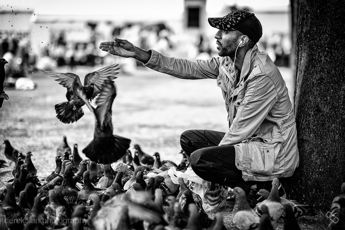
I recently uploaded a video to YouTube featuring a selection of my street photography during the 2014 Commonwealth Games in Glasgow (Scotland). It's kind of a video contact sheet in a way, as there are a few shots in there that are obviously short sequences. There is one picture in the video that seems to stand out for some people and as I remembered it was a lengthy sequence, I thought it would make a great Digital Contact Sheet. Feel free to check out the video mentioned above by clicking HERE. Click on the images below for a 1500px wide version.

I came across this guy feeding pigeons at George Square during the 2014 Commonwealth Games. I shot a few frames leading up to what you see above using the 10-24mm lens that Fuji had sent me to try out, but it was a bit wide so I switched to the 56mm f1.2. As you will see from the contact sheet, I started off at the subjects right hand side, but the background was messy and I moved from a low POV to standing. I still wasn't getting what I was looking for and I knew there was a good shoot here. I don't often spend as much time on a single scene when shooting street photography, but I felt it was worth sticking with and besides, neither the subject or the pigeons were bothered by me being there. I was using the Fuji X-T1. The X100S would typically be my weapon of choice, but I was testing lenses for Fuji too.

I moved around the scene in a clockwise direction, taking more shots than I normally would have, but the birds were changing constantly and I knew it would be a tiny move either way that could make the shot. I started off at f4, but as I moved to the subjects left side, I switched to f1.2 to blur the background and loose the distractions. Sometimes you can see all the elements of a photo and you just need to wait or keep shooting until those elements come together to make that single frame that works in all the right ways. Sometimes you wait and the scene falls apart and you get nothing.
 The image above is the straight out of camera JPEG. These last couple of years I've started to wear glasses, but I look over the top of them when looking through the viewfinder, tipping my head forward to try to get in as close as possible. This is not the best way to get level horizons, so as you can see from above and the final image below, I had to straighten the picture in post. But the point of showing the SOOC version is to let you see how nice the Fuji JPEG's are. The X-Series are the first digital cameras that I feel could have useable files without the need for computer work. If fact, adding Contrast and Clarity in Lightroom is all you might need for a great shot.
 This is the finished shot (above). 1/4000th of a second at f1.2 & ISO 200. After straightening the horizon as much as I could without chopping off part of the guys feet and hat, I sent it out the Nik's Silver Efex Pro 2 to get converted to B&W. This is my own preset for street photography, but it's mostly just a good mixture of Contrast and Structure. As long as my picture is exposed properly, it's a one click process in SEP2 and then save back in to Lightroom ready for export. As you saw from the contact sheet, there were many usable shots (maybe as many as 15), but on this occasion I felt that there was a possibility of something better. I was waiting on a gesture from the subject or something interesting from the birds. As I pressed the shutter and the image was displayed in the EVF, I knew I had got what I hoped for. In that single gesture of the hand, I knew I had what to me looked almost biblical. That was the last frame I shot of the scene with the X-T1 and the 56mm. Although I shot six more with the X100S and the TCL-X100, I knew it was pointless as I had the one I was looking for.
P.S. I have a new story published on the Kage Collective site today called Fashion Consciousness
The Digital Contact Sheet :: Episode 5
 I know I'm a week late with this, but I've had a lot going on recently and I wanted to give the previous post a bit of time at the top. I've selected a sequence of 25 shots that mostly aren't that amazing, but it shows that not every frame needs to be a great shot. But as I've said before, it can be more important to tell the story, and that can often mean choosing a lesser photo that's part of the overall story. Remember that some of these shots will reveal larger versions when clicked on.
 The digital contact sheet above, shows the photos straight out of camera (OOC). I have all my X Series cameras set to +1 Sharpness and the files are actually usable OOC. Add a bit of Contrast and a small amount of Clarity in Lightroom and the files really pop. Check out my buddy Patrick La Roque,'s test photos from the X100s HERE for some amazing examples of OOC files from Fuji's latest X-Trans sensor. Make sure you read his X100s review HERE
 This is my favorite frame, but straight OOC it's as flat as a witches tit and a bit overexposed. The composition is a little bit too centred for my liking, but it'll be too tight if I crop it at the same aspect ratio. I don't want it looking like a 10x8, so I'll have to live with it. I love that I shot this so close with the 35mm f1.4 and the guy had no idea I was even there!
 This is the edited colour version and to get to this point I did the following. I added my home grown Lightroom Preset '1:02. 20 Contrast & 15 Clarity' which does what it says on the tin. If you shoot with an X-Trans sensor Fuji and use LR4, it's a good idea to have a couple of presets that add about +20 contrast and a few variables of Clarity (+5, +10, +15 works well). I tend to apply these after import, but not on import, or you're stuck with them. I then added a Graduated Filter from the left with -1.82 Exposure to darken the uniform. I added a -30 Vignette (preset) and then boosted the Contrast up to +36 to make it pop a little more.
 It still wasn't reaching it's full potential, the main reason being that the colour wasn't doing anything to enhance it. So if the colour doesn't do it justice, it has to go. I made a virtual copy and applied my own Contrasty B&W preset and reduced the Highlight Slider a bit. The preset had re-set the Vignette slider to zero, but had darkened the shadows via the Tone Curve. I then applied a -20 Vignette to bring the edges that little bit darker. So this is the finished edit and was included in my essay 'A Mute Reminder' on The Kage Collective website.
 And finally, here are the other four picks from the contact sheet. The two colour shots at the top only have contrast and clarity added. They were actually usable straight out of camera. The shot at the bottom right was converted using my Contrasty B&W preset in LR4 and the one on the left was converted to B&W using my own custom preset for street photography in Nik's Silver Efex Pro 2.
So that's it for Episode 5. I hope this has been interesting and shown that a photo straight out of camera might only be half way there. Remember that everything I've done to these photos is the equivalent to what would be done in a darkroom. There's no Photoshop trickery involved, just film-like editing.
If you found this post useful, you might like Shooting Street Photography With The Fujifilm X100. My settings and method for shooting street.
The Digital Contact Sheet :: Episode 2
 I thought it would be a good idea to use Episode 2 to look at white seamless portraits. I met Ryan at my brothers 50th birthday party, where he was booked to provide the nights entertainment with his one man magic show. He's a very talented and highly entertaining performer and it's definitely worth seeking out one of his shows! I was shooting candids with the X100 and Ryan had asked if I would email him some of the photos. When I did email some photos to Ryan, I planted the seed for a portrait shoot and a couple of weeks later we got together to do this shoot. I used the Lastolite 6' x 7' HiLite background with the optional vinyl train. I shot with both umbrella and softbox that day. I use a large piece of plexiglass on the floor to give me a nice reflection under the subject, which looks great on both black or white white set-ups. I'll put some links at the end of the post to examples.

Above : This is one of the many frames that I used from this shoot, it's definitely not the best, but I wanted to choose something with a lot of negative space so that you could see how a shot can look so big, but actually be done in a small space. I really like negative space and I hate it when I hear a lot of photographers on the web giving advice like 'fill the frame'.

Above (left) : I decided to use a chair half way through the shoot, so that we could change it up a little. I started with the chair turned backwards and Ryan leaning on the back. I was pretty sure I wasn't going to use these shots, but I just needed to start somewhere and let it evolve.
Above (right) : We then re-introduced the cards (I had already shot some with a black background). Ryan started messing around with the deck, but it looked a bit stiff, due to the straight-on position of the chair. It's very easy to loose contrast with the HiLite as the lights inside the background are blowing it to pure white and coming straight into the lens.
The Lastolite HiLite : For those of you that are not familiar with the HiLite series of backgrounds - They basically come in a circular bag and pop out to their full size (in this case 6' x 7') just like a reflector. Then, with the HiLite lying flat on the floor, you lift each corner of the front section and place one of the rods to hold the front and rear apart. Stand the HiLite up and insert one or two lights inside and close the zips.
There's a two stop rule to white seamless, where the background should be two stops brighter than the main light. I would say a stop and a half works better with the highlight, to avoid loosing contrast. I always use a light meter when shooting with the HiLite these days and would definitely recommend you do to. I like to shoot at f8 with the HiLite. I aim to get my main light at f8 and the background light at f11.5. I then add a fill light to whatever looks good (if needed). I have also used another two lights recently, on the floor, outside of the vinyl train and blowing the floor behind the subject to white.
Below (top) : I moved the chair to an angle it made for a much more interesting photo. Ryan just ran through a series of shuffles and tricks. This was before I had the 60" umbrella, so I'm using two smaller ones as a main and a fill.

Above (bottom) : I move in closer so that I'm not throwing away pixels and I'm also getting Ryan at a higher resolution. At this point I started to realize that being a magician is similar to being a writer or a musician. You spend a lot of time on your own, practicing and perfecting your craft and it's even more lonely than editing photographs on a computer. This thought obviously came from Ryan's isolated look. I knew at that point that I wanted to put him in a big white room, isolated to one corner.
Below : This is the shot I wanted to use. I checked that the background was blowing to pure white and used a mixture of the Gradient Tool and Brush tool in Lightroom to get rid of all the things outside of the background. I then converted it to black and white. Ryan is a bit too central in this shot, but sometime you don't have the option when using such a small background.
I then moved over to Photoshop and as I knew everything was pure white, I selected the crop tool and set my background swatch to white. I then dragged the crop tool out to the full size of the photo and grabbed any of the four corners to pull the photo out to the desired amount of negative space (hold down shift to keep the aspect ratio the same), then hit enter and everything is filled with white. The result is the photo at the top of the post.

It's great to look back at photos that you shot in the past and see that you're getting better all the time. If I was shooting this now, I would work on my lights more to prevent losing so much contrast. Click here for an example of a recent shoot with great contrast.
You can see more of the Ryan Davidson shoot by clicking on these links White Background or Black Background
For more information on shooting and editing white seamless I would suggest reading Zack Arias's feature on his blog starting of course with Part 1. Better still, buy his Studio Lighting course on Creative Live. It's well worth the money and probably THE best thing to come from Creative live!
That's it for this episode of The Digital Contact Sheet. Leave me a comment if you get anything out of this or if you have any suggestions on how the feature could be better. I would also appreciate it if you could spread the word to anyone who you think would find this feature useful.
Fujifilm X-Pro1 & iPad :: A Night At The Museum
Four shots taken inside Kelvingrove Art Gallery & Museum in Glasgow (Scotland) with the X-Pro1, edited and uploaded to the web using an iPad. I used Nik Software's Snapseed to tweak the photos and Apple's connection kit to get the photos from the camera to the iPad. This is what I'll be using when I go to Italy in a couple of months. I'll also be using FilterStorm quite a bit. Anybody tried Photoshop Touch for the iPad?


Fujifilm X-Pro1 :: Street Portraits & Post Processing
This street portrait was shot using the 35mm f1.4 at 200 ISO, 220 sec at f2.8. It was a very sunny day, but I waited for this guy to move into the shade and then asked if I could steal his soul. He had just completed a run for Sport Relief (charity). Please click on the images and pixel peep larger files on Flickr.
 CONVERTED TO BLACK & WHITE IN NIK'S SILVER EFEX PRO
I love Nik Softare's Silver Efex Pro! Don't get me wrong, you can get a nice black and white out of Lightroom 4 or CS5, but Silver Efex Pro is just amazing!
 EDITED IN LIGHTROOM BY ADDING +20 CONTRAST, +20 CLARITY & +0.55 EXPOSURE
It doesn't take much post to make the X-Pro1 files look even more stunning. I think I'll make a Lightroom preset to batch proccess the files, as the +20 Contrast & +20 Clarity seams to work on most photos.
 STRAIGHT OUT OF THE CAMERA
Even straight out of the camera, the results are great. I'm pretty happy using this, but when you tweak it slightly (like the second image), it really shines!
 HERE'S A CROP TO SEE THE QUALITY BETTER

I can't make up my mind if I prefer colour or black and white for this guy, so I've posted one of each. Let me know in the comments what you prefer. It was a very sunny day, so I'm ok with the shirt being blown-out, I'd rather that than the face being under exposed. Click HERE to see their opposites.

Workflow Wizard 2:: The ExpoDisc
 Back on the workflow challenge again, trying to speed things up. After watching the excellent course by Zack & Jody Gray on Creative Live last week, I was amazed at how little time they spend on post production. Start to finish, from importing the images to album design takes them just five and a half hours. Now that's fast, really fast!
So what's the secret? Zach & Jody say it's all down to getting white balance and exposure consistent and accurate in the camera using an ExpoDisc. So I thought I'd give it a go and happily handed over my cash to the nice man at Warehouse Express. So two days later and £79+p&p lighter, I received a 77mm ExpoDisc in the mail. The first thing I noticed was that it didn't have any threads to let you screw it on to a lens. It just stuck on the front of my 85mm 1.4 as if by magic (it might actually be magnets). Buy the size for your largest lens and then just hold it over the front of your Smaller ones. It even works on the tiny X100 lens.
 The ExpoDisc works by using your camera Custom White Balance function. Canon users get the short end of the stick here, as there are more steps involved in setting a custom white balance and you need to either put the camera on manual focus, or get used to using back button focus. But as I don't own a Canon DSLR, I can't go into detail about how to go about it here (please check your manual). I'll be using a Nikon D300s for this test, but you can apply it to the method your camera uses.
You need to have your camera set to Manual Mode and Custom White Balance. For most Nikon cameras, you would press and hold the WB button on the top left of the camera, then turn the thumb dial until the display reads 'Pre' (right hand side).
Now before I go any further; getting the correct exposure is not an exact science with the Expodisc, and even more so with a Nikon. To get an exposure reading and set custom WB, stand where your subject is and either point the lens back to your shooting position, or toward the light source (as you would with a light meter). Which one you choose will depend on the lighting conditions, but mostly it will be back toward your shooting position.
 Please note that the exposure reading you get from a Nikon differs by 1 stop when the camera is set to grab a custom WB (flashing 'Pre').
1a. Camera pointing back toward shooting position, and exposure set before entering into custom WB capture mode (flashing 'Pre').
1b. Camera pointing back toward shooting position, and exposure set after entering into custom WB capture mode (flashing 'Pre').
1c. Camera pointing toward light source, and exposure set before entering into custom WB capture mode (flashing 'Pre').
1d. Camera pointing toward light source, and exposure set after entering into custom WB capture mode (flashing 'Pre').
Please note that the exposure reading you get from a Nikon differs by 1 stop when the camera is set to grab a custom WB (flashing 'Pre').
1a. Camera pointing back toward shooting position, and exposure set before entering into custom WB capture mode (flashing 'Pre').
1b. Camera pointing back toward shooting position, and exposure set after entering into custom WB capture mode (flashing 'Pre').
1c. Camera pointing toward light source, and exposure set before entering into custom WB capture mode (flashing 'Pre').
1d. Camera pointing toward light source, and exposure set after entering into custom WB capture mode (flashing 'Pre').
NIKON D300s: Setting custom WB.
- 1. Place the ExpoDisc on the front of your lens with the white side facing the lens.
- 2. Hold the camera in front of your subject and point it back toward your shooting position (see above).
- 3. Adjust your ISO to suit the lighting conditions.
- 4. Set the aperture to what you want to use.
- 5. Set your shutter speed making sure it's at least one over focal length (50mm = 1/60).
- 6. Make sure your meter readout is centre (correct exposure).
- 7. Press and hold the WB button until 'Pre' flashes.
- 8. Press the shutter button to fire a shot (it won't show up on your memory card).
- 9. The camera display should be flashing 'good' to confirm success.
- 10. Remove the Expodisc and shoot. Adjust shutter speed if you need to adjust exposure.
*
The steps above look a lot, but it actually only takes a few seconds to do.
The following examples of different light types are shot as follows. Left image. Aperture Priority and Auto WB. Centre image. Manual mode with exp/WB taken toward shooting position. Right image. Manual mode with exp/WB taken toward light source.
 DAYLIGHT (from window on a cloudy day)
'
DAYLIGHT (from window on a cloudy day)
'
 INCANDESCENT
'
INCANDESCENT
'
 FLUORESCENT
'
FLUORESCENT
'
 The shot on the left is auto WB and the shot on the right is using the ExpoDisc (cloudy windo light).
***
The shot on the left is auto WB and the shot on the right is using the ExpoDisc (cloudy windo light).
***
I'm pleased with the ExpoDisc and I'm looking forward to trying it out on a proper job with different lighting conditions. If it can save a lot of time in post it will be worth the money. If your exposure and white balance are consistent and correct, a preset in Lightroom or Aperture could be applied at import to add a bit of contrast. That should de-flatten RAW images and give you files that are spot on.
ADDENDUM-----------------------------------------------------------------------------------------------------------------------------------------------
My friend Patrick LaRoque asked in the comments, if there was much difference between the ExpoDisc and a regular grey card? So I tested a few options and to be honest there isn't a lot of difference. I think the ExpoDisc is a little more user friendly when it comes to shooting on the go. Even the Colour Checker Passport has a small grey card which is handy, but doesn't fill the frame. Being able to use the ExpoDisc to set exposure is a bonus to. Have a look at the results below or click here for a larger version.

FilterStorm:: The Best App For Photographers?
 There's a lot of great photography apps out there, but most of them are geared toward one or two features. Some lean toward shooting and uploading straight toTwitter, Facebook etc, some do tilt/shift and some only do black & white. Thanks to Apples camera connection kit, I can now take the SD card from my Fujifilm X100 and import the photos straight onto the iPad 2. I needed an app that could then resize the files to my blog sizes. I tried PhotoResizer, which did the job, but was a little sluggish and again a one trick pony.
FilterStorm is what the Photoshop app should have been like. It does a huge amount of different things and it does them really well. Apart from Settings, Load Photo Star Rating and Automations, The app is split into 4 sections, which are in the form of tabs - Export, Metadata, Filters and Canvas. Export does what you would expect, like saving back to your photos folder of sending by email, Flickr, FTP or Dropbox. You can also choose size and quality options here too. The Metadata tab is set for viewing meta and renaming photos by default, but click on Settings and you get whopping great 31 switches that let you turn on features like Keywords, Captions, Subject, Category, Location, Copyright, Usage, Contact Details...etc. The meta section really is a wolf in sheep's clothing. Canvas is where you can crop, scale, rotate, flip,straighten, Scale and add borders. This is another huge section. Filters is the place where we pixel pushers all like to be. It has Brightnes/Contrast, Curves, Hue/Saturation, White Balance, Sharpening, Blur, Black & White, Clone, Tone Mapping, Text, Noice Reduction, Noise, Redeye Brush, Colour, Vignette, Posterize and Add Exposure. The great thing is that it does them all really well.
This is the best i photo editing app that I have ever used, and I've tried plenty. The thing is, I've just checked on the Apple App Store so I could wright the price (2.39 UK) and saw that there is a pro version (8.99 UK) with even more features. My one gripe would be that if you have already bought the standard version, you shouldn't have to pay the full price for the pro version. That goes for apps that are different on the iPhone & iPad, if you buy it on your iPhone and the iPad is a more expensive & more powerful app, then you should only have to pay the difference and not the full cost. But all that aside, Filterstorm is the best app for photographers I have came across to date. It was made with photojournalists in mind (although photojournalists shouldn't need a clone tool). I'm going to buy the Pro version now, as there are a few features that I quite fancy (batch editing being but one). Filtersorm (iPod, iPhone & iPad) & Filterstorm Pro (iPad only) are available on the App Store. The photo above is from the Pro version.